Things I discovered this week, I never realized before
This
week, I found out about how limited the way, we humans perceive
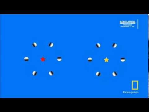
peripheral vision can be. The moving or changing of elements that are
too far away from each other - or out of the central/peripheral vision's
radius are responsible for the chance, users actually get sight of the
element.
What I learned this week
In purpose of
introduction, we started off with the question, how the eye is
constructed and which parts of the eye are in charge of which particular
tasks.
Quick facts about the eye:
- The Retina is a light-sensitive layer at the back of the eye and covers about 65% of the surface
- Rods and cones are photosensitive cells in the retina what convert light energy into valid brain signals (which are then transmitted through optic nerves). While Rods cannot distinguish colors (they work even better in low-light), cones are responsible for color vision.
- The Fovea is located in the Retina's center and represents the eye's sharpest point. This is also, where most of the Cones are located. That's why
We also learned about the terms of "peripheral vision" and "central vision" and did some tests about it, that literally opened my eyes:
Another aspect, which got me thinking as well, is the way, color-blind people perceive colors - but also, how different devices might display colors in different ways. An aspect, we designers need to be aware of.
An approach, to tackle difficulties like that, could be to focus on using dominant colors for important content
and as well avoid to use opponent colors, placed on or directly next to
each other or even as pattern used in the background of text.
Inspirational content

How I might use this content in Experience Design
These videos got me aware of the fact, how being focused on certain elements can cause other elements to disappear from the visual field.
We sometimes forget that they exist because we only focus for one
thing. In the end, our attention is limited. Designing with the user's
actual perception in mind can deliver better

My TOP 3 design rules of the week
- Nine percent of men are color-blind vs. only half percent of women. Take this into account, when designing solutions for male audience.
- Do not overwhelm your users - recurring design patterns (e.g. used in terms of safety) can lead to less attention given
- The users' peripheral vision determines, what users can see : Even though the middle of the screen is important for central vision, don’t ignore what is in the viewers’ peripheral vision. Make sure, important information is not placed outside of the radius.
![[W2] Perception - color vision and peripheral vision](/_next/image?url=https%3A%2F%2Fimages.unsplash.com%2Fphoto-1516307318288-46d4194fe79e%3Fixlib%3Drb-1.2.1%26q%3D85%26fm%3Djpg%26crop%3Dentropy%26cs%3Dsrgb&w=3840&q=75)